Wednesday, May 6, 2009

Magazine Publication


Preliminary ideas:
I've decided to do a food/dessert magazine focusing on chocolate.  It will have interesting tid-bits on chocolate, the history, health factors etc as well as a couple recipes.  I'm going to buy different chocolates and chocolate pastries over the weekend and take good photos of them with my friend Annie who will be the "chef" or "model" handling them.
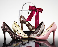
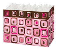
This publication is meant for young to middle-aged women, I want it to have a clean, simple, and fun look to it and I'm going to use warm browns, tans, soft pinks, fushia, white and black.  Here are some swatches and images I'm thinking of using as my color inspiration.

Sunday, May 3, 2009

Project 2 Description

I always prefer a simple clean style in design, especially in a magazine.  I looked at VOGUE, National Geographic, and Food & Family.  Food & Family was hard to find a grid in, and I'm not sure if any particular style would work for me since it doesn't have articles as much as recipes.  I DID like their content page as it had nice images as thumbnails.  
VOGUE was interesting because their articles were relatively short but they put emphasis on key quotes, making the txt bigger and on top of the large photograph.  I think that kind of photography will be hard to use for this project because they are so huge but we'll see.  They also enlarge single letters, the beginning letters of paragraphs etc.  They use black white and red.
National Geographic was my favorite if we have to use large articles.  The photographs are well chosen and colorful and the copy is in clear columbs only broken by larger quotes which are in an accent color which matches the photograph.
In my project I want to use this idea of having a quote bigger and in a different color than the body text.  I like the idea of doing a magazine on something I enjoy like fashion or food.  The real question now is how do I MAKE photographs good enough and where do I find articles interesting enough that suit the photographs?  I suppose I need to find out more about the project before I can make any concrete decisions.

"The Grid" Reading Assignment Reflection

In the article's introduction it mentions and shows examples of four different kinds of grids.  I wasn't previously aware that there were TYPES of grids in design and I'm curious to know how to use each of them and how they help differently than the others.  I also wonder how people designed before this grid system was invented.  Or perhaps that's the difference between designing something and just art.
Reading about the early manuscripts and icons was very interesting to me because I have taken a calligraphy course and Im sure even then i have no idea the time, effort and pain-staking detail that went into those documents and pieces of art.  Seeing grids to them is further evidence of the precision, skill and craft put into them. 
I thought it was very interesting how the grid was eventually used as a visual graphic element itself in the 70's after Swiss design became popular in the 60's.  To use a technique as a piece of your design is an interesting concept especially as we look at it in design history.
Overall I found the article interesting although I must admit it was very difficult to follow.  The author used very sophisticated language in a way that almost made me read a sentence three times over before I understood it.

Project 1 Routine Book


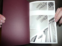
My final piece for my routine book.  I'm eventually going to do something with the cover, maybe something white or die-cut.  I have some typography to work on to make it more consistent.  I'm also thinking of adding one or two spreads in the middle that are less busy to let the reader "breathe" and blank starting and ending pages.