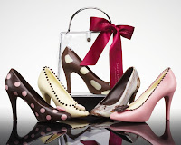
 My back cover for the magazine. This page was tough even though it's just one photo. Choosing the right photo that links to the front cover but doesn't overshadow it or compete with it was hard, I also thought white would be nice to have on the outside seeing as though there is so much on the inside. Overall I think it will look great as long as it's printed straight.
Sunday, June 7, 2009
 My back cover for the magazine. This page was tough even though it's just one photo. Choosing the right photo that links to the front cover but doesn't overshadow it or compete with it was hard, I also thought white would be nice to have on the outside seeing as though there is so much on the inside. Overall I think it will look great as long as it's printed straight.


 My 3 regular articles, a recipe page, and a truffle page, I either used a very similar grid to the feature article or I used the second one I came up with, the one with 3 photos on the right. In retrospect It could have been nice to have one page have the 3 photos on the left but It works. This breaks up the large scale of the full page photos with smaller ones and gives me the opportunity to use more of them.


After I got the cover generally blocked in I started with the table of contents page. It was the page I was second most exited about and I find If I start tackling the aspects of a project i'm exited about I will work faster and happier and more successfully. This pims photo was also one of my favorites and I put it in compositionally how I thought worked and started putting in page numbers. I realized I wouldn't have room so I had to extend the tan negative space using photoshop, then I started playing with where the type would go in relation to the flower.
After blocking in that page I wanted to start tackling the articles. I had never done columns of copy before so I started by choosing pictures I liked and just threw everything on a page and started messing with it.
I knew i wanted big quotes, I like the way it looks but I realized I had too much going on on one page and I looked for inspirational references online.


The first thing I did was come up with a name for my magazine. I wanted a desserty kind of feel but sophisticated so nothing like "sweet treats." And how better to class something up than to say it in french so after translating a few words I liked the flow and look of Delicieux the best. I was debating between two of my favorite photos for the front cover. I wanted to do the front cover first because as a reader it's the first thing you notice that draws you in and compels you to read. I have a bank of about 400 photos from the photo shoot of all the chocolate I bought (too many to put on this blog so i figure we can see them as they're in the spreads) and I liked these two the best for a cover. The one with my friend Annie's face I thought was really fun and personable while the chocolate tower was more serious and sophisticated. I chose to go with the face because I didn't want this to be just a food magazine but more personable and interactive, less still-life and more people. Chocolate is to be handled and eaten, not to sit on a table.
Wednesday, May 6, 2009
Magazine Publication


Preliminary ideas:
I've decided to do a food/dessert magazine focusing on chocolate. It will have interesting tid-bits on chocolate, the history, health factors etc as well as a couple recipes. I'm going to buy different chocolates and chocolate pastries over the weekend and take good photos of them with my friend Annie who will be the "chef" or "model" handling them.
This publication is meant for young to middle-aged women, I want it to have a clean, simple, and fun look to it and I'm going to use warm browns, tans, soft pinks, fushia, white and black. Here are some swatches and images I'm thinking of using as my color inspiration.
Sunday, May 3, 2009
Project 2 Description
I always prefer a simple clean style in design, especially in a magazine. I looked at VOGUE, National Geographic, and Food & Family. Food & Family was hard to find a grid in, and I'm not sure if any particular style would work for me since it doesn't have articles as much as recipes. I DID like their content page as it had nice images as thumbnails.
VOGUE was interesting because their articles were relatively short but they put emphasis on key quotes, making the txt bigger and on top of the large photograph. I think that kind of photography will be hard to use for this project because they are so huge but we'll see. They also enlarge single letters, the beginning letters of paragraphs etc. They use black white and red.
National Geographic was my favorite if we have to use large articles. The photographs are well chosen and colorful and the copy is in clear columbs only broken by larger quotes which are in an accent color which matches the photograph.
In my project I want to use this idea of having a quote bigger and in a different color than the body text. I like the idea of doing a magazine on something I enjoy like fashion or food. The real question now is how do I MAKE photographs good enough and where do I find articles interesting enough that suit the photographs? I suppose I need to find out more about the project before I can make any concrete decisions.
"The Grid" Reading Assignment Reflection
In the article's introduction it mentions and shows examples of four different kinds of grids. I wasn't previously aware that there were TYPES of grids in design and I'm curious to know how to use each of them and how they help differently than the others. I also wonder how people designed before this grid system was invented. Or perhaps that's the difference between designing something and just art.
Reading about the early manuscripts and icons was very interesting to me because I have taken a calligraphy course and Im sure even then i have no idea the time, effort and pain-staking detail that went into those documents and pieces of art. Seeing grids to them is further evidence of the precision, skill and craft put into them.
I thought it was very interesting how the grid was eventually used as a visual graphic element itself in the 70's after Swiss design became popular in the 60's. To use a technique as a piece of your design is an interesting concept especially as we look at it in design history.
Overall I found the article interesting although I must admit it was very difficult to follow. The author used very sophisticated language in a way that almost made me read a sentence three times over before I understood it.
Project 1 Routine Book


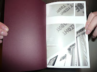
 My final piece for my routine book. I'm eventually going to do something with the cover, maybe something white or die-cut. I have some typography to work on to make it more consistent. I'm also thinking of adding one or two spreads in the middle that are less busy to let the reader "breathe" and blank starting and ending pages.
Wednesday, April 29, 2009


After our in-class critique of a print out version I decided to change all of my images to a RGB version of greyscale which, when printed, will give a purplish tint to the photos. I then chose a purple that matched for the text that was not white. I switched the font to one easier to read and decided to remove all of the punctuation (exept commas) and switched captial "I"s to lower case ones to make it feel more like they were my thoughts and not something that had to be grammatically correct.

 Next I started placing pages on inDesign and making grids for my images. After playing around with dimensions and formats I found a general layout with variations I liked to use as a system throughout my book. I wanted some pages to have bands of white on the top and bottom and some with bands through the image itself. I also placed the text in the general location I thought they would go. After seeing all the text I realized I had too much so I cut a lot of it out so the focus could be more on the images.
Monday, April 6, 2009
Daily Routine Narrative: Morning Routine
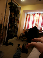
I'm awake, new day, comfy, warm, sleepy
what time is it? 10:27, wow, i slept a long time, I don't like sleeping in too long, it's wasting day time
I sleep in this late when I go to bed at one
I need to get up
*stretch*
Hi Po, my boyfriend Donovan gave him to me for my 22nd birthday
Po is a giant stuffed panda, he takes up a corner of my bed
I like to pet him
why am I still tired?
I need to buy my school books today, I'll leave early
the door creaks open slightly and it scares me, like my alarm scares me, i'm so glad I don't have to use my alarm on monday and wednesdays,
My cat must have come in
yep, I feel my cat jump on my bed, he's standing on my leg
he must be cold
*hug my pillow*
reach over for my Bible, turn on the light, I read a chapter every morning, pray for a good day
Isaiah 54, thats a good one,
relax
no rush, like my last school schedule, I love my new school schedule
*get up*
don't disturb the cat
shower time, put the towel close to the shower so i don't have to drip on the floor getting it,
I'll use my shower gel Donovan bought me for Christmas, then he'll tell me I smell good, I like it when he tells me I smell good
what should I wear today? Who am i going to see today?
Haven't worn this shirt in a while, which pants go with this? What pants will keep me warm enough? I want to wear those jeans but they're too long to wear with my puma shoes
I have to wear my puma shoes, I don't want to, but I have to be comfy, don't wear heels or you will regret it walking to school, walking down that big hill
I'll put my hair up first though, its all wet, better dry it or I'll be cold soon, i'm always so cold it's annoying
blow dry my hair, does this fry my hair? It will dry more later, put it up so it will be curly, wheres my clip? My favorite clip
ok get dressed
I need to see, blurry vision is annoying, contacts are annoying but at least I can see,
put in contacts first then mascara or it will smudge
mascara, I don't like makeup, mascara is pretty though
what earrings shall I wear?
gold to match the buttons on my sweater
It's raining outside better wear my ski jacket, it has a hood, it will keep me warmer too
coat, check
phone - so I can text Donovan - check put that in my inner pocket
ipod, HAVE to have music, check
bus pass, that was expensive, check
ok i'm done in my room
i'm hungry, breakfast, cereal, honey bunches of oats are yummy, but the milk makes me cold
make my lunch, or I'll die
now brush my teeth
put on my coat
backpack, homework, hard drive - thats the most important thing
ready to go
its raining but thats ok I'll be warm enough
its kind of refeshing
here I go again
Subscribe to:
Comments (Atom)


